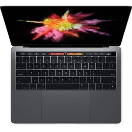
We don’t usually write reviews on this website as we are not a “review business”. We leave that to the likes of Tech Radar and other such online companies. For that reason we aren’t posting a load of photos of the device; there are millions online all the same, of the sockets, hinge, screen and so on. We don’t need to do that here. This is us talking in a plain language, and real world use of this rather nice device.
We starting researchng the Pro
When we started looking at the Pro, we watched and read every review within about 4 pages of Google search. From unboxings to full closeup reviews. We really wanted to know a lot about it, but without all the technical stuff. Who cares if it loads an App in .2s quicker?! But we did buy one.
Now we don’t normally do review, but after we got it we thought: “why not?”.

The Macbook Pro arrived
So we took delivery of this 2019 Macbook Pro 13″, set it up, and the migration from the Air to the Pro is pretty painless.
Apple has a Migration tool that does this from the moment you turn it on, and it’s done over your own WiFi. The time it takes depends on how much data you have. This one took about an hour. It migrates everything, even software that is not compatible with it – as we found out (an old version of Photoshop). But once it is done, you then login as usual and it looks the same.
The Keyboard
Initially the keyboard feels totally different. For those who have wanted to try the new keyboard, you stand in a PC World type place and type away, but standing in a big room, you don’t really get a proper feel for it just typing some ‘crazy fox’ sentence into Mail.
Personally, I can type faster on this than on the old keyboard. It definitely has a shorter depression distance, but it feels less ‘clicky’ and more solid. The back lighting is also better as it lights the characters rather than all around the keys (like on the ‘Air); so it’s less boxy and squares at night.
You do still feel like you could give those keys a bit of a type-hammering too. If you are a programmer, or type A LOT in your job, this keyword is terrific.
The Touchpad
Move down a little and you have the touch pad. It’s been said that this one is the “best in the business”. Maybe. Not tried many others so couldn’t really say. What I can say is that it feels almost medically precise. As it is Haptic only, there is no physical downward-pressing of anything, but it seriously feels like it does. You do forget it almost instantly.
The size of the Touchpad’s ‘real estate’ at first glance looks like it would be too big; like you catch it on your palm somewhere as you type, but you don’t. It’s a really nice size touch pad. It does get grease marks from your fingers easily, but it’s also very easy to clean. Apple states using just water or a dry cloth. Our solution: window cleaner. It has very little abrasive chemical to it, but it cleans it really well. They do advise against alcohol cleaning as it can remove some quality.
Not tried the pressurise part of it yet, when you push and then push harder to do something else, but we have done the pressing and you do feel it.
The Sockets – or lack there of
The lack of sockets is a bug, but it’s one you quickly come to bare. There is no standard USB or SD Slot, or even the glorious MagSafe connection. But once you are plugged into the power, you kind of forget about it. And in the few weeks we have had it, not once have we caught the cable and panicked.
You can get adapters for your USBs. We bought one for just £5.95, so these posh ones for £25 are ok, but if you are on a budget, then it is possible to get a cheaper one. The item has yet to arrive, but when it does, we will probably post a link to it on this page.
The screen
What about the screen…. well yes there is the big change from the ‘Air. Retina. You do see a much clearer, much sharper image. Videos look better too, and the fact the bezel is black makes it “seem” edge to edge. It isn’t, but it definitely gives that feel. One thing that you do notice is that the camera, being in the black bezel, disappears. On the old ‘Air, it was there as a black dot in the grey bezel. You don’t see it anymore. That’s a subtle thing, but worth mentioning.
Something else worth mentioning is what happens when you open the lid. Maybe laptops are not built with the right ‘weight’ in the right places. Most will open the lid and hold the base so it doesn’t lift up. While you are still likely to do that with this, you actually don’t need to. You can use one finger and lift it from closed to fully open without anything else. That said, after a while you get a ‘thumb print’ right where the camera lens is. It’s a small thing – being able to open it like that – but does add to that sense of quality.
Apple quality product
So what about this ‘Apple Quality’ then? Well, it’s wonderful. We have messed around with many laptops. Those that can bend back and turn into tablets. Dell and many others. Some that are really really thin as a card, but they feel cheap when compared with this device. They keyboard feels like it will last years, the touch pad when pressed makes a sort of metallic sound, like you are using some form of military weapon, and it just looks the part.
So why did we buy this over the ‘Air? Firstly, the difference in cost wasn’t that wide any more. Then were all the reviews (from proper review websites, not ours), with many showing the Geek Bench statistics and they were staggering. We cannot really lay claim to understanding what all those figures mean. But when the ‘Air has one figure of 4,500 and the ‘Pro is 13,500, and it’s just a few £100 more, why wouldn’t you? We use it for a great many things, so we felt better to go for what is seen as the best in this screen size by many. Another thing we read was that the Macbook Air didnt’ have the same quality of colour, definitely not the ‘Nits’ of Brightness as the Pro, and it didn’t have the Touchbar.
Ah yes, the Touchbar…
Well this is not something that made us buy it. It was the difference in performance compare with the additional cost. But the fact it had that extra…errr… gadget? Who doesn’t like a toy!? We do use it. Probably not to the extent that Mr Schiller or Mr Cook blurted on about, but somethings are cool to have there. The easy to ‘add new folder’ is there. Much easier than going up to the menu, down the sub menu and so on.
A tap to send a Tweet using the Twitter App.
And some of the emoji stuff is made a bit easier. Maybe we will use it more as time goes on, but it’s funky to see it changing as we use different things . It feels a little like it is ‘alive’, and saying ‘do you want these?’. Sad I know, but it is kinda cool.
The negative about the Touchbar
If we had one negative about it – apart from “is it really essential” – is the Control Strip. When you are on the desktop it’s mostly hidden away on the right, with a < left chevron to expand it for colour, light, volume etc. It’s like that as there is a space between that and the Esc button. So when you open an App/Program, that space is utilized by said App.
However, we feel it would be cool if there was a change in Default for that, to be ‘expanded’ when no other apps are using that space. So when you open the App, the Control Strip ‘slides’ back and makes way for the other buttons.
Battery Life
This is one of those really important factors, and we cannot really review that here. We haven’t tested it. Sometimes days the Pro is used a lot. Other days, less so. Maybe one day we will have it on at 100% from 8am, and see how long it will go, using it in the morning. and at many times in the day. Until then, we cannot really comment.
All we will say – Apple, Tim Cook…. bring back the blasted MagSafe! Sooo much easier to let that magnetise in place and charge it. Rather than getting the lead, lining it up and pushing it in there to a ‘click’. Rant over.
What about how it looks?
These days how a laptop looks is actually fairly important. You want to feel proud of what you are using in your office, or local coffee shop. It’s one of the reasons we bought this one, as we sat by someone a few months ago and they were using it. It did look good.
The Space Grey that we got (just a good change from the default colouring of the Macbook Air of 2015), looks the part. Mirrored logo (better than lit one), just looks so professional. Anything in that charcoal matt shade often feels Batman-esk! This certainly does. When you take it out of your case, it just feels like something to be proud to have.
It’s quite a small device, but it packs a heck of a lot in it. Granted we only got the 128GB version, as most of our storage is on a Cloud (except software). So didn’t need any more than that. We had the standard setup of 4GB RAM too as we don’t do use a lot of video editing, and from what we read, this can handle it with ease anyway. We do most of our work online, using WordPress of course, and this is lovely for that. Better than an iPad would be in our view.
Then there is protection for the Macbook Pro
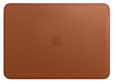
We just could not bring ourselves to spend over £150 on a leather ‘sleeve’ for this device. It’s an astonishing price to pay for a leather envelope. Something that has no pockets. No handles. Nowhere to keep anything else. Doesn’t provide all round protection.
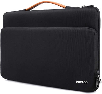
 What we wanted was a case that you could put the device in to keep it totally safe. Plus pockets, and a handle. So we bought one of these from Amazon: TomToc Laptop Sleeve. It has a thickish soft interview, you slide it in from the size and zipup. Totally sealed and protected. It has a patented corner system for more ‘drop’ protection (something I don’t think Apple’s version has). There is a leather or leather-look handle that comes out nicely. And a zip side pocket for cables, or charger, Portable HDD, business cards etc. It’s very nicely made.
 Compare that, with this from Apple, which is an extraordinary price – their Apple Leather Sleeve, for £179.00.
In our view, we got a better deal. More security. More pockets for things. Easier to carry and £154 lighter!
How does it feel to use?
We like it. It looks very professional, and for what appears a smaller device, packs a punch. We recently took it for a day out for meetings with a client, as while we are in Lincolnshire, we are a Skegness Website Design agency too – so it went to the beach! A full day there, using the Mac for notes, browsing and demonstrating, and it was fine. Didn’t need charging.
Finally, the price
Laptops are not cheap. Some are, but they feel it too. And even if you only want it for a “bit of browsing and email”, you will spend a lot of your time using it. More than you realise. So you want it to be something that you enjoy using. We enjoyed using the Macbook Air. It must have travelled over 10,000 miles with us over the years, but still looked like brand new at the end. Even tho we needed to get rid of it. We have seen cheaper ones and they look worn. White or black shows thru the paint of the device.
Not so with Apple. You do pay quite a premium, but we got a brilliant deal with this one, and it’s being used for at least 6-9 hours a day.
Macbook Pro Negatives?
Yes there are a few. It didn’t prevent the purchase but here they are.
Lack of Magsafe: why get rid of something that all Apple Macbook users loved. Makes no sense at all. If they can develop their own Chips and fit them in there, they can develop a means to keep that.
No standard USB Socket: every single laptop on the market – non-Apple – has them. They are all, pretty much, the same thickness. Yet they can fit all the sockets that the customers need. As a result, those who have these devices, now need extra devices because Apple couldnt’ be bothered to think “now”. They just think “future” all the time. It is a rant, and we are getting an external plug device (mentioned earlier in this review), which isn’t costly. But still – come on. Customer’s want and need it. Stop taking things away they want and need.
Price: Well it is high compared to others, so it is a negative. But we did get a good deal, and the quality just stands out. Compared with the ‘Air’, this is far far better.


Leave a Reply
You must belogged in to post a comment.