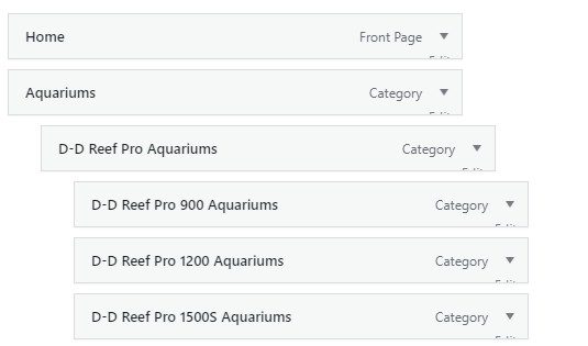
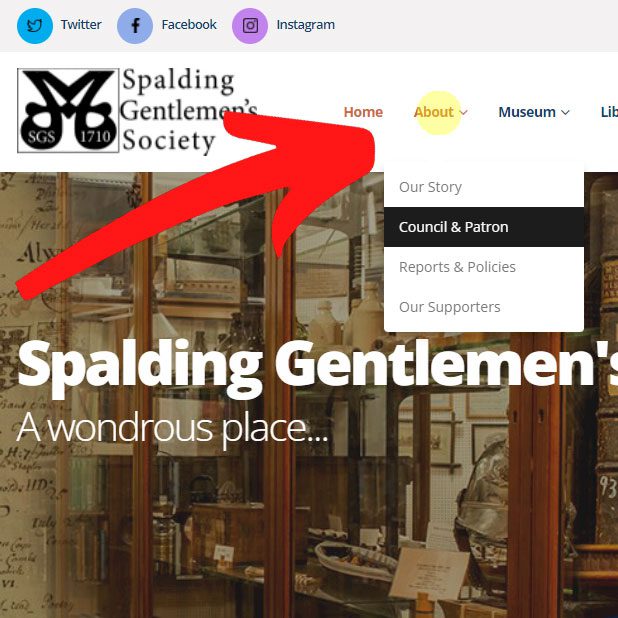
This article is about how we had a theme developed beyond its default, to allow Tablets/Mobile to tap on a menu, and it expand… most won’t do that!
Do you have website where you have dropdown menus. Such as Mens, and then the dropdown shows Jeans, TShirts and so on? What about Services, and you have a Services Pages that lists your service, but within the dropdown, are your key services?
What happens if you are on a Tablet and you tap ‘Mens’ or ‘Services’… does it just go to the page, or reveal that dropdown?

Courtesy of Tutors & Exams UK
We were alerted to this issue by a local client, who is a charity. They showed us the issue of a site we were actually creating for them, so we looked into this, and yes, that’s what happens. Even with premium WordPress Themes, you tap on it and rather than revealing the dropdown menu, it just goes to the page.
 This has become more of a problem with larger tablets. There was a time when you either had desktop or mobile, but on iPad or even iPad Pro, these screens are bigger and as such they display the full desktop menu.
So what is the solution to desktop tablet dropdown menus?
We have resolved it. At least for the websites we operate. And we can for you.
Using a genius developer, we have enabled some of our websites to be able to tap on the main menu on a tablet, and it expands the menu. You can read it, check the sub menu items and if you want, click them. Or, just tape the main link again, and it will go to it. If you are reading this right now on a tablet, try these websites:
https://www.tutorsandexams.uk
https://marinefishshop.co.uk
https://www.acetills.com
These sites are just examples of where we have enabled this. It helps for SEO too, as users get much more information, much easier.
It’s such a simple thing, and most would never really spot it. But a client did, and we had it developed to work even better.


Leave a Reply
You must belogged in to post a comment.